본 게시글은 개인 공부를 하면서 기록 목적으로 작성한 내용입니다.
잘못된 내용이 있다면 제보 부탁드립니다. 🙇♂️
1. 개 요
오늘은 리액트로 포트폴리오를 만들면서 겪었던 레이아웃 배치 문제에 대해 기록해 보고자 한다.
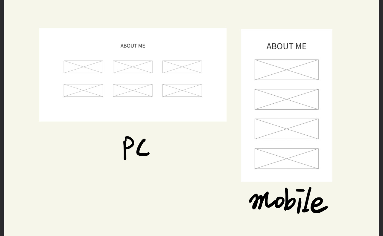
먼저, 나의 정보를 보여주는 About 컴포넌트 페이지를 기획했던 시안은 다음과 같이 정보를
담고 있는 Item 6개를 PC에서는 3행 2열, 모바일에서는 1열로 나열하는 화면을 만들고자 하였다.
- 모바일 화면에서는 1열, PC에서는 3행 2열로 레이아웃 구현
- 각 콘텐츠 길이가 다르기에 max-width: 16.5rem;으로 일정한 너비 지정
...

// 스타일 코드
const AboutCont = styled.section`
  max-width: 1140px;
  margin: 0 auto;
  padding: 3rem 0;
`;

const Title = styled.h2`
  text-align: center;
  font-size: 2rem;
  font-weight: bold;
  margin-bottom: 2.5rem;
  text-transform: uppercase;
`;

const AboutUl = styled.ul`
  display: flex;
  flex-wrap: wrap;

  @media (min-width: 320px) and (max-width: 767px) {
    flex-direction: column;
    align-items: center;
    row-gap: 2rem;
  }

  @media (min-width: 768px) {
    flex-direction: inherit;
    justify-content: space-between;
    row-gap: 2.5rem;

    :after {
      display: block;
      content: "";
      width: 33.33%;
      height: 100%;
    }
  }
`;

const AboutLi = styled.li`
  width: 100%;

  @media (min-width: 768px) {
    width: 33.33%;
    row-gap: 1rem;
  }
`;

const AboutDiv = styled.div`
  display: flex;
  width: 100%;
  max-width: 16.5rem;
  margin: 0 auto;
  padding-left: 0.5rem;

  & svg {
    color: #2a92d5;
    width: 32px;
    height: 32px;
    margin-right: 1.5rem;
  }

  & p {
    line-height: 1.5rem;
    font-weight: 300;
  }

  & strong {
    font-size: 1.2rem;
    font-weight: 600;
  }

  & a:hover {
    color: #2a92d5;
  }
`;

const About = () => {
  return (
    <AboutCont>
      <Title>About Me</Title>
      <AboutUl>
        <AboutLi>
          <AboutDiv>
            <FontAwesomeIcon icon={faUser} />
            <p>
              <strong>이름</strong>
              <br />
              Kyoo130
            </p>
          </AboutDiv>
        </AboutLi>
        <AboutLi>
          <AboutDiv>
            <FontAwesomeIcon icon={faCalendar} />
            <p>
              <strong>생년월일</strong>
              <br />
              2022.06.20
            </p>
          </AboutDiv>
        </AboutLi>
        <AboutLi>
          <AboutDiv>
            <FontAwesomeIcon icon={faLocationDot} />
            <p>
              <strong>주소지</strong>
              <br />
              서울특별시 강남구
            </p>
          </AboutDiv>
        </AboutLi>
        <AboutLi>
          <AboutDiv>
            <FontAwesomeIcon icon={faPhone} />
            <p>
              <strong>연락처</strong>
              <br />
              010-1234-4567
            </p>
          </AboutDiv>
        </AboutLi>
        <AboutLi>
          <AboutDiv>
            <FontAwesomeIcon icon={faEnvelope} />
            <p>
              <strong>이메일</strong>
              <br />
              abc1234@kakao.com
            </p>
          </AboutDiv>
        </AboutLi>
        <AboutLi>
          <AboutDiv>
            <FontAwesomeIcon icon={faGraduationCap} />
            <p>
              <strong>최종학력</strong>
              <br />
             OO대학교 졸업
            </p>
          </AboutDiv>
        </AboutLi>
        <AboutLi>
          <AboutDiv>
            <FontAwesomeIcon icon={faCodeBranch} />
            <p>
              <strong>깃헙</strong>
              <br />
              <a
                href="https://github.com"
                target="_blank"
                rel="noreferrer"
              >
                https://github.com/Kyoo130
              </a>
            </p>
          </AboutDiv>
        </AboutLi>
        <AboutLi>
          <AboutDiv>
            <FontAwesomeIcon icon={faB} />
            <p>
              <strong>블로그</strong>
              <br />
              <a
                href="https://velog.io/@kml9003"
                target="_blank"
                rel="noreferrer"
              >
                https://velog.io/@kml9003
              </a>
            </p>
          </AboutDiv>
        </AboutLi>
      </AboutUl>
    </AboutCont>
  );
};

export default About;
2. 문제 발생
모바일과 PC 화면에서는 문제가 없어보이나, 반응형으로 서서히 화면을 줄이게 되면, 각 콘텐츠의 길이가
다르기 때문에 눈에 보이는 화면상 여유 공간이 달라 디자인이 깨지는 것과 같이 보이는 문제가 발생하였다.
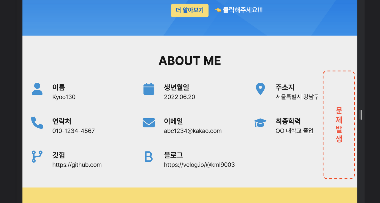
백그라운드를 지정하여 보았더니 실제로는 일정한 간격을 잘 유지하고 있으나, 콘텐츠의 길이가 적은
오른쪽 열에 상대적으로 여유 공간이 많아 의도한 것과 다르게 화면상 레이아웃이 깨지는 것처럼 보여졌다.

3. 문제 해결
3-1. 레아아웃 구조 변경
처음 문제 해결을 위해 고민한 방법은 화면상에 보여지는 것을 기준으로 마크업 구조를 바꾸는 것이었다.
<!-- HTML 코드 -->
<div class="cont">
    <ul>
        <li>콘텐츠1</li>
        <li>콘텐츠4</li>
        <li>콘텐츠7</li>
    </ul>
    <ul>
        <li>콘텐츠2</li>
        <li>콘텐츠5</li>
        <li>콘텐츠8</li>
    </ul>
    <ul>
        <li>콘텐츠3</li>
        <li>콘텐츠6</li>
    </ul>
</div>
/* CSS 코드 */
.cont {
	display: flex;
    justify-content: space-between;
    flex-basis: auto;
}
하지만, 이렇게 구조를 변경하면 고민하며 만들었던, 웹 접근성을 위한 마크업이 아니게 되고,
결정적으로 모바일 화면에서 콘텐츠의 순서가 바뀌는 문제가 발생하여 근본적인 원인를 해결할 수 있는 좋은 방안이 아니었다.
3-2. Grid 속성 사용하기
두번째로 고민한 방법은 display:grid; 속성을 사용하고, 마크업 구조를 바꾸는 방법이었다.
grid 속성을 사용하니 아래 나열한 장점들이 있었고, 반응형 웹에서도 유연한 화면을 구현할 수 있었다.
- 모바일 화면에서는 1열, PC에서는 3행 2열로 레이아웃 구현
- 불필요한 div를 없애고, ul > li > 콘텐츠 구조로 마크업 변경
- 각 콘텐츠는 너비가 다르더라도 별로도 일정하게 지정하지 않음
- justify-content: space-around; 속성을 통해 유연하게 간격을 유지할 수 있도록 구현
...

const AboutCont = styled.section`
  max-width: 1140px;
  margin: 0 auto;
  padding: 3rem 0;
`;

const Title = styled.h2`
  text-align: center;
  font-size: 2rem;
  font-weight: bold;
  margin-bottom: 2.5rem;
  text-transform: uppercase;
`;

const ListCont = styled.ul`
  display: grid;
  grid-template-columns: repeat(1, auto);
  justify-content: center;
  row-gap: 2.5rem;

  @media (min-width: 768px) {
    grid-template-columns: repeat(3, auto);
    justify-content: space-around;
  }
`;

const TestLi = styled.li`
  display: flex;

  & > svg {
    color: #2a92d5;
    width: 32px;
    height: 32px;
    margin-right: 1.5rem;
  }

  & > p {
    line-height: 1.5rem;
    font-weight: 300;

    & > strong {
      font-size: 1.1rem;
      font-weight: 600;
    }

    & > a:hover {
      color: #2a92d5;
    }
  }
`;

const About = () => {
  return (
    <AboutCont>
      <Title>About Me</Title>
      <ListCont>
        <TestLi>
          <FontAwesomeIcon icon={faUser} />
          <p>
            <strong>이름</strong>
            <br />
            Kyoo130
          </p>
        </TestLi>
        <TestLi>
          <FontAwesomeIcon icon={faCalendar} />
          <p>
            <strong>생년월일</strong>
            <br />
            2022.06.20
          </p>
        </TestLi>
        <TestLi>
          <FontAwesomeIcon icon={faLocationDot} />
          <p>
            <strong>주소지</strong>
            <br />
            서울특별시 강남구
          </p>
        </TestLi>
        <TestLi>
          <FontAwesomeIcon icon={faPhone} />
          <p>
            <strong>연락처</strong>
            <br />
            010-1234-4567
          </p>
        </TestLi>
        <TestLi>
          <FontAwesomeIcon icon={faEnvelope} />
          <p>
            <strong>이메일</strong>
            <br />
            abc1234@kakao.com
          </p>
        </TestLi>
        <TestLi>
          <FontAwesomeIcon icon={faGraduationCap} />
          <p>
            <strong>최종학력</strong>
            <br />
            OO대학교 졸업
          </p>
        </TestLi>
        <TestLi>
          <FontAwesomeIcon icon={faCodeBranch} />
          <p>
            <strong>깃헙</strong>
            <br />
            <a
              href="https://github.com/Kyoo130"
              target="_blank"
              rel="noreferrer"
            >
              https://github.com
            </a>
          </p>
        </TestLi>
        <TestLi>
          <FontAwesomeIcon icon={faB} />
          <p>
            <strong>블로그</strong>
            <br />
            <a
              href="https://velog.io/@kml9003"
              target="_blank"
              rel="noreferrer"
            >
              https://velog.io/@kml9003
            </a>
          </p>
        </TestLi>
      </ListCont>
    </AboutCont>
  );
};

export default About;
4. 마무리...
이번 포트폴리오를 만들면서 각 아이템이 가지고 있는 콘텐츠 길이가 다를 경우 마진과 패딩이 아니더라도
사용자가 보는 화면에서 깨지는 것처럼 보이는 것을 어떻게 해결하면 좋을지에 대해 방법을 고민하게 되었고,
그리고 div 파티를 줄이고, 웹 접근성을 고려한 마크업을 구성할 수 있을지에 대해 고민하며 만든 프로젝트였다.
유연한 화면을 만들기 위해 무조건 flex 만을 쓰기 보다는 현재 구현하려는 화면에 어떤 방법론이 좋을지를
고민하며 만들어 볼 수 있어서 좋은 예제를 얻은 것 같다. 계속해서 공부를 이어가보자! 오늘의 기록 끝...